Checkout & customer account for a car subscription platform
introduction
For a car subscription platform, I redesigned two key parts of the customer journey: the checkout and the customer account. The concept was designed to quickly answer three questions: What does the subscription cost? Is the vehicle available? What can I do myself after ordering?
The goal: to make ordering easier to understand, to show costs transparently at an early stage, and to let customers manage requests online after ordering.
My contribution: I was responsible for research and analysis, information architecture, four user journeys, the design system, and responsive UX/UI. I developed the concept independently and coordinated it closely with the product team.

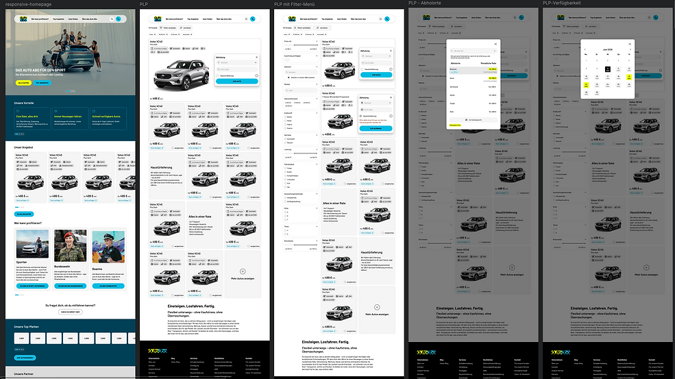
Previous design

Results at a glance


Concept overview
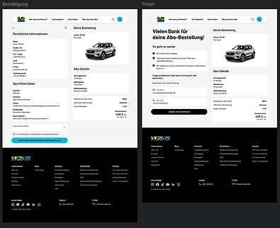
The solution connects checkout and the customer account into a seamless customer journey. The checkout is designed to make the vehicle, its availability and subscription costs easy to understand. In the customer account, users can manage favourites and personal details, resume applications and handle service requests themselves. The concept therefore covers everything from vehicle selection to self-service after ordering.
Discovery
The initial assessment combined usage data with qualitative observations:
-
Google Analytics 4: Analysed conversion and bounce rates.
-
Microsoft Clarity: Evaluated heatmaps, click paths and session recordings.
-
UX team workshop: Collected and organised pain points and observations on a Figma flow board.
Key observations
-
Offers and included services were difficult to understand and compare.
-
Vehicle availability depended on the location.
-
The application required extensive information, and previously entered details were difficult to change.
-
There was no personal account area or digital self-service.
Definition
Problem statement: How can users order a suitable vehicle with transparent costs and manage their application and subsequent requests without unnecessary steps?
Design opportunities
-
Explain the offer, availability and price clearly and early.
-
Give the checkout a clear structure and make changes easier.
-
Bring orders, personal details and services together in one customer account.
Ideation & solution
The pain points led me to three priorities: explain costs and services early so that offers can be compared; allow applications to be resumed in the customer account so that entered information is retained; and bring personal details and services together so users can manage their requests in one place.
Design execution
Four user flows were designed:
-
Creating an account directly during checkout
-
Ordering a replacement vehicle while signed in
-
Ordering a replacement vehicle without signing in
-
Ordering a vehicle from the customer account
Example flow: Account creation during checkout. This flow combines ordering a vehicle with creating a personal account. Saved details and the application are then available centrally for later use. The journey and UI views below illustrate the solution, focusing on one representative flow.
The information architecture and user journeys informed low-fidelity wireframes, a reusable design system, and responsive high-fidelity designs for the customer account and checkout.
Outcome
The result is a UX/UI concept for a clearer customer journey, from finding a vehicle to managing the subscription after signing the contract. The customer account brings together personal details, favourites, resumable applications and digital services, while the checkout improves orientation and cost transparency.
Project status: I left the project before launch, and it was subsequently continued independently. I therefore do not have launch or usage data. The following points describe the design concept and proposed success criteria, rather than measured results.
Measuring success: Analysis plan & success criteria
Analysis plan: I would examine drop-off at each checkout step, completion rates and time to complete. I would also assess understanding of pricing, vehicle availability and priority tasks in the customer account. GA4 events, Clarity recordings and moderated usability tests would combine quantitative and qualitative insights. I would segment the results by device type and by new and existing customers.
Evaluating success: Before launch, I would establish a baseline and define tracking and test tasks. After launch, I would evaluate the same metrics over a comparable period: using an A/B test if the product and traffic allow it, or otherwise a transparent before-and-after comparison that specifies the period and sample size. Usability tests would also show whether users understand pricing correctly and complete tasks independently.
The following KPI targets are proposals, not achieved results. Establish a baseline and confirm the targets with the product team.
-
Checkout abandonment: Reduce by 10% relative to the baseline, measured through the GA4 funnel.
-
Checkout completion: Increase by 10% relative to the baseline, measured from the start to a successfully submitted application.
-
Pricing transparency: At least 90% task success in a usability test where participants correctly identify the total price and included services.
-
Self-service: At least 70% task success for priority account tasks without assistance.
Next steps
-
Test the four journeys with representative users and prioritise critical issues.
-
Validate the proposed KPIs against the baseline and product context.
-
After a potential launch, analyse the checkout funnel and account usage, then iterate.
Conclusion:
The new concept creates a clearer and more digitized customer journey – from vehicle search to administration after the contract is concluded.
The customer account allows users to centrally manage personal data, save favorites, continue applications, and use services independently. At the same time, the checkout process has been restructured to improve orientation and transparency.
Site map

User Journeys
Flow for account creation at checkout

Flow for the follow-up vehicle order: (Logged in)

Flow for the follow-up vehicle order: (not logged in)

Flow for vehicle order from customer account

Low-fidelity wireframes

More responsive design templates