Dr. Live – Telemedicine App
Dr. Live is my own UX/UI project for a telemedicine app. I developed a concept designed to make it easier for patients to find doctors, book appointments, and communicate with practices. The focus is on clear user guidance, ease of use, and building trust.
The concept includes a search function for suitable doctors, online appointment booking, reminders, and a chat function with the practice. Video consultations, e-prescriptions, and reviews are planned as future additions.
I initiated the 2025 project myself and designed the UX/UI concept – from personas and information architecture to user flows and wireframes, all the way to the design system. The roadmap describes a possible future implementation.
Brand: Dr. Live
Year: 2025
Category: Self-initiated UX/UI project
Work process
• Feature development
• Personas
• Research
• Information architecture
• User Flow
• Navigation
• Corporate Design
• Wireframing
• Testing
• Roadmap creation
Personas

Mom, 34 years old.
Lisa
Place of residence: Dortmund
Occupation : Part-time office work
Need : Quick access to pediatricians when their daughter has a fever or for themselves.
Digital behavior : Uses apps like WhatsApp, Instagram, online banking
Motivation : I would like to easily schedule appointments online, preferably as a video.
Challenge : No time for waiting on hold or long commutes

Dad, 46 years old.
Markus
Place of residence : Cologne
Occupation : Construction manager, often on the road
Health : Back problems, high blood pressure, ignores doctor visits
Digital behavior : Uses his smartphone daily, but is not tech-savvy.
Motivation : Online consultation during lunch break instead of waiting room
Challenge : High appointment load, preventative healthcare is often postponed

Pensioner, 71 years old.
Erika
Place of residence: Small town in Bavaria
Health : Osteoarthritis, regular check-ups
Digital behavior : Has a tablet, uses it for video calls with family
Motivation : I don't want to take a taxi to the doctor's office every time.
Challenge : Uncertainty in using apps; requires simple operation.

Pensioner, 76 years old.
Robert
Place of residence : Rural region in Brandenburg
Health : Diabetes, blood pressure, regular medication prescriptions
Digital behavior : Owns a smartphone.
Motivation : Receive prescriptions digitally, have consultations conveniently from home.
Challenge : Lack of mobility, often long waiting times for specialists.

General practitioner, 51 years old.
Dr. Neumann
Place of residence : Medium-sized city
Health : Overload, daily appointment stress, many telephone inquiries
Digital behavior : Familiar with practice management software, open to digital solutions
Motivation : To relieve the burden on practices and also provide online patient care. Challenge : Data protection, integration into existing workflows
User needs
Save time: No waiting on the phone or in the waiting room (e.g., parents with children).
Easy to use: The app should be intuitive, even for older people or those who are not tech-savvy.
Online access to medical help: consultation from home, on the go or on vacation.
Video consultation: Direct contact with a doctor without having to go to the practice.
Digital prescriptions / e-prescriptions: Get your medication quickly and easily.
Reminders & Tracking: Be reminded of appointments, be able to track progress.
Trustworthy communication: The doctor should be accessible and empathetic.
Data protection & security: Health data must not fall into the wrong hands.
Freedom of choice when choosing a doctor: Being able to select one's own doctor (e.g., specialist, language, proximity).
Empathy Map
Lisa
Thinks & feels
"I don't have time for doctor's appointments." - "I have to organize everything."
Listen
"You need to make an appointment today!" - "The practice is full again."
Sees
Long waits at the doctor's office, confusing websites, many health services.
Says
"I don't have time to be on the phone forever!" - "Why can't this be done online?"
Does
Googles symptoms, calls the doctor's office, waits for a callback, sometimes doesn't even get an appointment.
Pain points
Stress due to being constantly available, lack of time, sick child, lack of flexibility.
Gains
Immediate help via app, easy operation, video instead of doctor's visit, appointment reminders.
Empathy Map
Doctors
Thinks & feels
They question safety, time savings, and the effort required for team and training.
Listen
Doctors are hearing that digital solutions are in increasing demand and that telemedicine is being promoted more and more.
Sees
They observe overloaded processes, digital progress among colleagues, and growing pressure to digitize.
Says
They emphasize the desire for simpler technology, clear billing, and more focus on medical work.
Pain points
They suffer from bureaucracy, technical problems, missed appointments, and uncertainty regarding data protection.
Gains
They want efficient processes, new patients, more flexibility and a modern practice image.
Competitive analysis
Anbieter | Video-Call | Chat | E-Rezept | UX/App | Zielgruppe | Stärke | Schwäche |
|---|---|---|---|---|---|---|---|
Dr. Live | ✓ | ✓ | ✓ | Sehr intuitiv | Familien,
Senioren,
Praxen | All-in-One | Neue Marke, wenig Vertrauen |
ZAVA | ✓ | x | ✓ | Einfach | Kurzberatungen | Schnelle Behandlung | Keine Beziehung zum Hausarzt |
TeleClinic | ✓ | x | ✓ | Gut | Alle gesetzlich
Versicherten | Hohe Bekanntheit | Kein persönlicher Arztkontakt |
Jameda | ✓ | x | x | Mittel | Alle, die suchen & bewerten | Bewertungsportal | Keine echten E-Services |
Doctolib | ✓ | x | x | Sehr etabliert | Arztpraxen, Patienten | Terminmanagement | Wenig direkte medizinische Hilfe |
Results of the competitive analysis
The competitive analysis served as a guide for my Dr. Live project: I compared existing offers to better understand the market and identify possible starting points for my concept.
My focus is on easy doctor searches, clear appointment booking, and accessible communication. The table documents my project-related assessment; the information about Dr. Live describes the planned concept, including future expansions.
MVP Features
For patients:
• Registration / Login (secure & easy)
• Doctor search with filters (e.g., specialty, language, location)
• Book appointments online
• Reminders & Notifications
• Chat with doctors or practices
• Data protection & secure login
For doctors / medical practices
• Appointment management
• Patient chat & file reception
• Save internal notes
V2.0 Features
• Start video consultation - (V2.0).
• Receive e-prescriptions - (V2.0).
• Read & submit doctor reviews - (V2.0).
• Upload & send recipes - (V2.0)
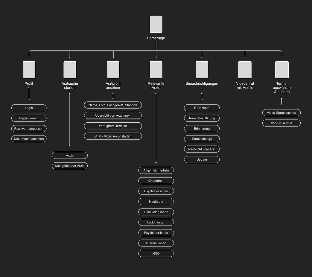
Site map
User Flow
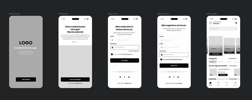
Login page

Low Fidelity Wireframe

Conclusion after UX research:
Through user research, I gained a deep understanding of the needs, expectations, and challenges of the target group. The insights I gathered helped me define clear requirements for the app and make well-informed design decisions. The results formed the basis for developing a user-centered design system that is both functional and intuitive.

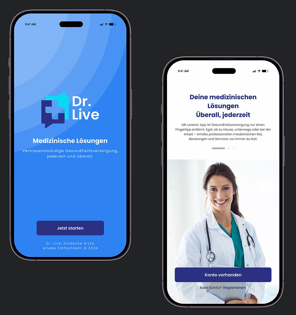
Design System


Colors

Components





MVP Roadmap
Goals
Facilitating access: Enabling patients to easily access digital medical services.
Validate quickly: Test the MVP in a realistic environment and develop it further using data.
User-centricity: Focus on intuitive operation, accessible UX, building trust.
Onboarding doctors: Recruiting medical professionals for video consultations.
Security & Trust: Working in compliance with GDPR, reliably and with data security.
Outlook: One-year roadmap
Q1: MVP & Validation
(Months 1-3)
Planned goal: To develop and validate a first app version with core functions.
• Target group definition & personas
• MVP: Login, doctor search, booking, chat and notifications
• Mid/high fidelity designs
• Development & internal testing
• Planned usability test with 5–10 users:
• Planned onboarding of 3–5 physicians for a pilot phase
Q2: Launch & Feedback
(Months 4–6)
Goal: Soft launch, genuine user feedback & functionality optimization.
Launch in a limited market (e.g., one city / specific field).
Integrate an in-app feedback system.
Improvements to UI/UX.
Evaluate appointment bookings and call quality.
Q3: Growth & expanding features (Months 7-9)
Planned goal: To further develop the app and involve more doctors.
• Expand search filters: language, insurance status and symptoms
• Improve onboarding for doctors
• Further develop existing chat
• V2.0: Prepare video consultations, e-prescriptions and assessments
• Explore potential partnerships with clinics and medical practices
Q4: Scaling & Monetization
(Months 10-12)
Goal: To test the business model and prepare the app for a broader market.
Recurring appointments / reminders for long-term patients.
GDPR audit, quality assurance.
Preparations for App Store / Google Play launch.
Create an investor presentation / business pitch deck.
Accessibility at Dr. Live
The goal is to ensure the application is accessible according to the
To ensure WCAG guidelines at level AA.
Visual accessibility
High color contrasts: Texts & buttons are easily readable for people with visual impairments.
Dynamic font sizes: Supports device settings for large font sizes.
Dark Mode / Light Mode: Eye-friendly display, selectable.
Pictograms + text labels: Clear icons + descriptive text, e.g. for buttons.
Technical
accessibility
Screen reader compatibility: Label text elements and buttons with ARIA labels.
Keyboard navigation: App is fully usable even without touch.
Accessible PDF documents: sick notes, prescriptions, etc., also compatible with screen readers.
Cognitive accessibility
Use simple language: Explain or avoid medical terms.
Visual step-by-step help: Example: "How do I start a video call?" as a tutorial.
Onboarding for first-time users: A short introduction with explanation upon first launch of the app.
Multilingualism (at least German / English / Turkish): Important basis for inclusive access.
Use medical terminology as a filter: e.g., "Show only Turkish-speaking doctors".
Visual navigation instead of text-heavy navigation: Icons, colors, clear structures help people with reading difficulties.
Linguistic & cultural accessibility
Realistic first steps (for MVP)
High: High color contrast & large font options.
High: ARIA labels for screen readers.
Method: Video onboarding or tutorial.
Medium: Multilingualism (German, English, Turkish).
In the long term: Accessible PDFs & keyboard navigation.


